The barcode that scans on your desk and fails at the till
A barcode is one of the few things on a pack that can be objectively wrong without looking wrong. It prints cleanly, it reads on the desk with a phone, and then it fails at the point of sale for reasons that were decided months earlier, on the artwork, by someone who never saw a verifier.
This is a short guide to what actually determines whether a barcode works, and what belongs in the artwork and print specification.
A barcode does not pass or fail; it gets a grade
The useful mental model is that a symbol is not correct or incorrect. It is measured, and the measurement produces a grade. ISO/IEC 15416 covers linear symbols and ISO/IEC 15415 covers two-dimensional ones; both produce a graded result from a set of parameters rather than a single yes or no.
That distinction matters commercially, because “it scans” is not a specification. A symbol that scans reliably with one scanner in one condition can fail with another, and the grade is what tells you how much margin you actually have.
The measurement conditions change the result
This is the part most often left out of an artwork brief, and it is the part that causes the arguments.
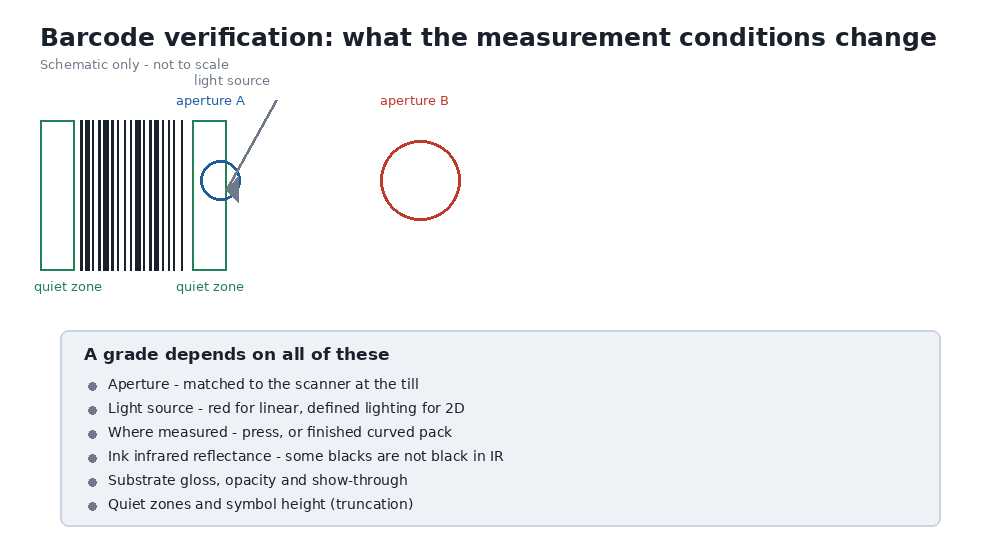
Aperture. A verifier measures the symbol through an aperture, and the aperture is chosen to match the scanner the symbol is expected to meet. Measure the same symbol through a different aperture and the grade can change. If the artwork specifies a minimum grade without specifying the aperture, the specification has not said which measurement it means.
Light source. Linear symbols are commonly verified under a red light source, and 2D symbols under a defined lighting arrangement. A symbol verified under one and scanned under another is being assessed under conditions that do not match its working life.
Where it is measured. A symbol graded at the press, on a flat sheet, is not the same as a symbol graded on a filled pouch, on a curved surface, or through a film. ISO/IEC 15415 explicitly addresses the curved-surface case, which is the normal case for anything in a pouch, sachet or sleeve.
Film is not paper, and that is the root of many failures
Most barcode guidance was written for paper labels, and flexible packaging breaks several of its assumptions.
Infrared reflectance. Many verifiers and scanners read in the near-infrared, where some black inks are not black. An ink that looks correctly dark to the eye can be nearly transparent in the infrared, which destroys the contrast the scanner depends on. Carbon-based blacks behave differently from some process blacks, and this is a print specification decision, not an artwork preference.
Specular reflection. Glossy and metallised films reflect light back into the scanner in a way that paper does not. The result is a symbol that measures well in one orientation and poorly in another.
Substrate opacity and show-through. On thinner or more translucent films, print on the reverse or the product behind the pack can reduce effective contrast.
None of these show up on a desk test with a phone. All of them show up at a busy till.
Quiet zones, size and truncation
Two failures are entirely avoidable and still common.
Quiet zones are the clear areas either side of a linear symbol. They are part of the symbol, not empty space around it, and artwork that crowds them shortens the scanner’s window for finding the symbol.
Truncation is reducing the height of a linear symbol to fit the design. It saves artwork space and reduces tolerance, because a shorter symbol gives the scanner fewer scan lines to work with. Where a design cannot accommodate the full height, that is a decision to make explicitly rather than by accident.
The X-dimension, the width of the narrowest element, has a similar character: smaller can be printed, and smaller is less tolerant of everything else on this list.
What belongs in the artwork and print specification
- The symbology, and whether a linear or a 2D symbol is required, and why.
- The X-dimension and the symbol dimensions, with the quiet zones identified as part of the symbol.
- The minimum acceptable grade, and the aperture and light source at which that grade applies.
- Where the symbol will be verified: at the press, or on the finished pack, or both.
- The ink, and its infrared reflectance behaviour rather than only its visual colour.
- The substrate and its surface, including whether the surface is curved at the point where the symbol sits.
- The placement rules: distance from seams, gussets and folds, and the orientation relative to the way the pack is presented at the till.
What a good grade will not fix
It will not fix a symbol placed where the film creases, because a crease is a physical interruption that no grade at the press anticipates.
It will not fix a design that relies on a colour contrast the scanner cannot see, whatever the symbol scores in visible light.
And it will not fix a mismatch between the scanner you verified against and the scanners actually in use. That is why the aperture belongs in the specification: it is how the artwork is tied to the equipment it has to satisfy.
For a fuller treatment of the parameters and how they are reported, our notes on barcode verification in flexible packaging set out the measurement conditions and the reporting fields.
Image credit: barcode verification schematic produced by J-Origin Packaging (own work).
Luna Luo, J-Origin Packaging
.